Diving Into Open Data
2018 Brief
One of my goals for this year is to blog more regularly, specifically at least twice a month. Another goal for the blog is to have at least 50% of my posts about data. Whether it’s machine learning, data science, data visualization or simply something I find interesting that is related to data. This post serves as a good start to both of those goals!
inewsource.org
Over the past 5 months or so, I’ve been in touch with a couple folks at a non-profit investigative news agency here in San Diego called inewsource. I initially found out about them while listening to my local NPR affiliate, KPBS. First, I have to say, they do excellent work digging into issues affecting us in San Diego County. When I checked out their website and found out they have a Director of Data, I decided to contact them. After one meeting, I knew I had to find a way to get involved.
The Problem With Remedial Classes
In mid-December, 2017, inewsource released a story in collaboration with the Hechinger Report investigating the remedial system in place at Community Colleges in California. Their story highlighted not only how ineffective remedial courses are, but they also exposed stark differences in the success rates between black and Latino students and students of other ethnicities. I found this story compelling, so I set out to do some digging of my own into this dataset. The dataset was easily downloaded as a .csv file from the inewsource data website. Once downoaded, I got to work using my favorite environment - jupyter notebooks using Python and Pandas.
The first thing I noticed when diving into this dataset is that it’s super-clean and 100% complete. Anyone who spends time working with public datasets knows that most of your time is spent cleaning up the data before you can get to the actual exploratory work (aka the “fun stuff”). The team at inewsource did an amazing job cleaning up and organizing the dataset before sharing it on their website. The first few lines contained some metadata describing the dataset, after that was the raw data in comma-separated values format. After reading the file into a pandas dataframe, it was a simple matter to remove the rows with metadata before processing the data further. Some of the first things I do when exploring a dataset are to look at the value_counts() for various columns to get a feel for how “balanced” the data is. For example, inspecting the ‘subject’ column quickly shows that there are about 50% more rows (observations) for “Math” than there are for “English”.
df1['subject'].value_counts()
Math       2785
English    1917
Name: subject, dtype: int64
This is simply a count of how many times each subject appeared in the “subject” column. i.e. how many rows contain either “Math” or “English”. This dataset tracks quantities of students in other columns. Another couple of handy tools are .shape and .describe().
df1.shape
(4702, 8)
df1.describe()
| students | sum | success | Levels Below | |
|---|---|---|---|---|
| count | 4702.000000 | 4702.000000 | 4702.000000 | 4702.000000 |
| mean | 52.618035 | 13.787325 | 21.388067 | 2.103998 |
| std | 105.548091 | 37.700770 | 24.052702 | 1.008383 |
| min | 1.000000 | 0.000000 | 0.000000 | 1.000000 |
| 25% | 3.000000 | 0.000000 | 0.000000 | 1.000000 |
| 50% | 13.000000 | 2.000000 | 14.290000 | 2.000000 |
| 75% | 50.000000 | 9.000000 | 34.620000 | 3.000000 |
| max | 1248.000000 | 627.000000 | 100.000000 | 4.000000 |
Running df1.shape shows us that there are 4702 rows in the original dataset, and 8 columns. When we run df1.describe(), we can see that each of our numerical columns have 4702 rows, confirming that this dataset is nice and complete.
At first, the data didn’t reveal much. However, after trying a few things, I got to a point where I started to take advantage of the power of pandas. Pandas has some very useful functions for grouping and aggregating data in dataframes that allows the user to tease information out of the data. For example, I sorted the dataframe by ethnicity and then performed a .groupby in order to group by ethnicity and course level below credit, summing the quantities for each resulting group. Result shown below truncated to the first two ethnicities for the sake of brevity. However, as you can see, stark differences exist between the success rates of two ethnicities shown.
df_eth.groupby(['ethnicity', 'Levels Below'])[['students','sum']].sum()
| students | sum | S_Rate | ||
|---|---|---|---|---|
| ethnicity | Levels Below | |||
| African Amer. | 1 | 6682 | 1983 | 0.296 |
| 2 | 5902 | 821 | 0.139 | |
| 3 | 3685 | 173 | 0.047 | |
| 4 | 2142 | 65 | 0.030 | |
| Asian | 1 | 12973 | 6386 | 0.492 |
| 2 | 7351 | 2408 | 0.327 | |
| 3 | 2770 | 371 | 0.134 | |
| 4 | 1181 | 102 | 0.086 |
At this point, with the data organized like this, trends and patterns started to emerge for me that helped spark ideas for how to proceed with exploring this dataset. After seeing this, I created a bar plot (shown below) of the success rate by ethnicity for each level below credit.
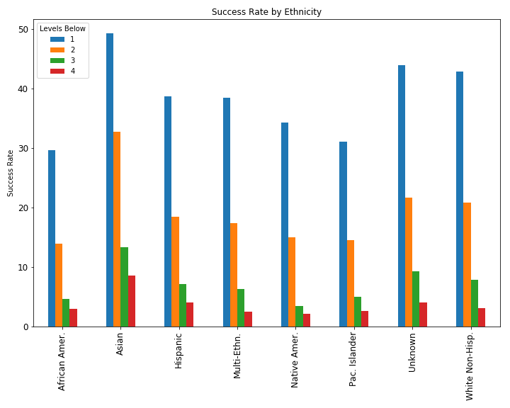 Intuitively, the success rate drops significantly the more levels a student is below credit-earning level. What is more telling is that, barring Asian students, minority students succeeded at much lower rates across all of the levels. Students who identified as African American were particularly impacted.
My next thought, as I proceeded down the path of collecting and displaying the data in different ways, was to somehow craft a chart that could show how often each ethnicity is assigned to each remedial level, and then show their success rates from those levels. I went to a familiar resource for data science tips, Chris Albon. On his website, I found an example for a stacked percentage bar chart. I had never made one of these charts before, and since it seemed to be the right chart for my needs, I got to work recreating it for this project.
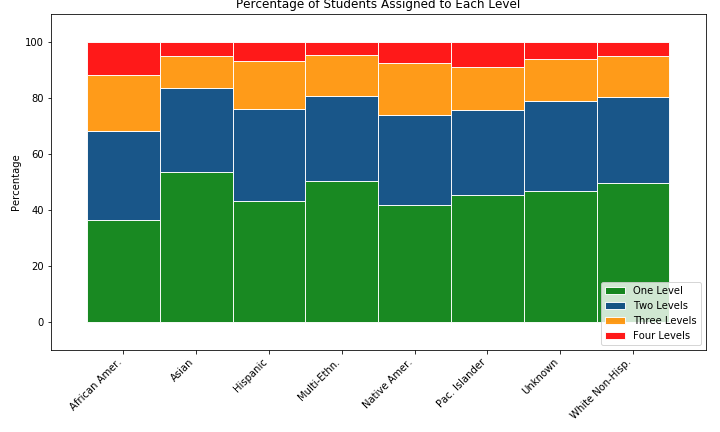
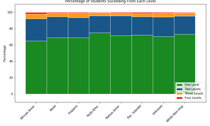 To me, these charts reinforce just how much more frequently African American Students are assigned to lower remedial levels than any other ethnicity. In general, I think they also show that the remedial system is broken, as success rates are poor, and beyond the first remedial level, they are downright abysmal. I also created a set of panel bar charts that compare the success rates of each ethnicity at every College (114 of them!) in the dataset. If you’re interested, click here to view that series of charts.
Conclusions
As is often the case, this analysis became an exercise in creating creative ways of visualizing the data. Part of storytelling with data is making it visual. In general, we humans are very visual learners, so it’s exciting when I learn a new way to visualize data. This project certainly led me down a path of challenging myself to learn new and different techniques. Fortunately, there is no shortage of examples out there, it’s just a matter of wrapping your head around them and adapting them to your needs. I can definitely keep digging into this dataset, I still think there are more insights to find. Not only am I familiarizing myself with the types of projects my friends at inewsource are working on, but I’m learning a lot about data exploration and visualization. Every time I work on a data project, I get a little better and a little more confident.
Share on Twitter Share on Facebook